Blog/Signage
Step-by-Step Guide
ADA signage basics: what every business in Puerto Rico should know
The sign next to your restroom door has more rules than most board games. Here are the ones that matter, in plain language.
The sign next to your restroom door has more rules than most board games. Letter height, letter style, braille, finish, how high it hangs, which side of the door it goes on. And, unlike a board game, nobody at the table has read the instructions.
The Americans with Disabilities Act applies in Puerto Rico the same way it does in the fifty states, so these rules are ours too. The good news is that the basics fit on one page. This is that page.
A quick disclaimer. This is a practical overview, not legal advice. Your architect, your inspector or the permit office has the final word on your project, and local building codes may add requirements of their own.
Start with the rooms that do not change
The strictest rules cover signs that identify permanent rooms and spaces: restrooms, room numbers, room names, exit stairways. If the room will still be that room next year, its sign needs raised lettering and braille so a person can read it by touch.
Several kinds of signs are exempt from the tactile rules, including building directories, menus, company names and logos, and temporary signs posted for seven days or less. A note for the record: the paper sign that has been taped to the supply room door since 2019 no longer counts as temporary.
Use raised letters a hand can read
On a tactile sign, the letters must be raised at least 1/32 of an inch from the background. They also have to be:
- Uppercase. All capitals.
- Sans serif. No italics, no script, no decorative fonts.
- Between 5/8 inch and 2 inches tall.
Yes, this means the elegant cursive font from your logo cannot be the tactile text. I know. It hurts me too. The logo can still appear on the sign; it just cannot be the part people read with their fingers.
Add braille directly below
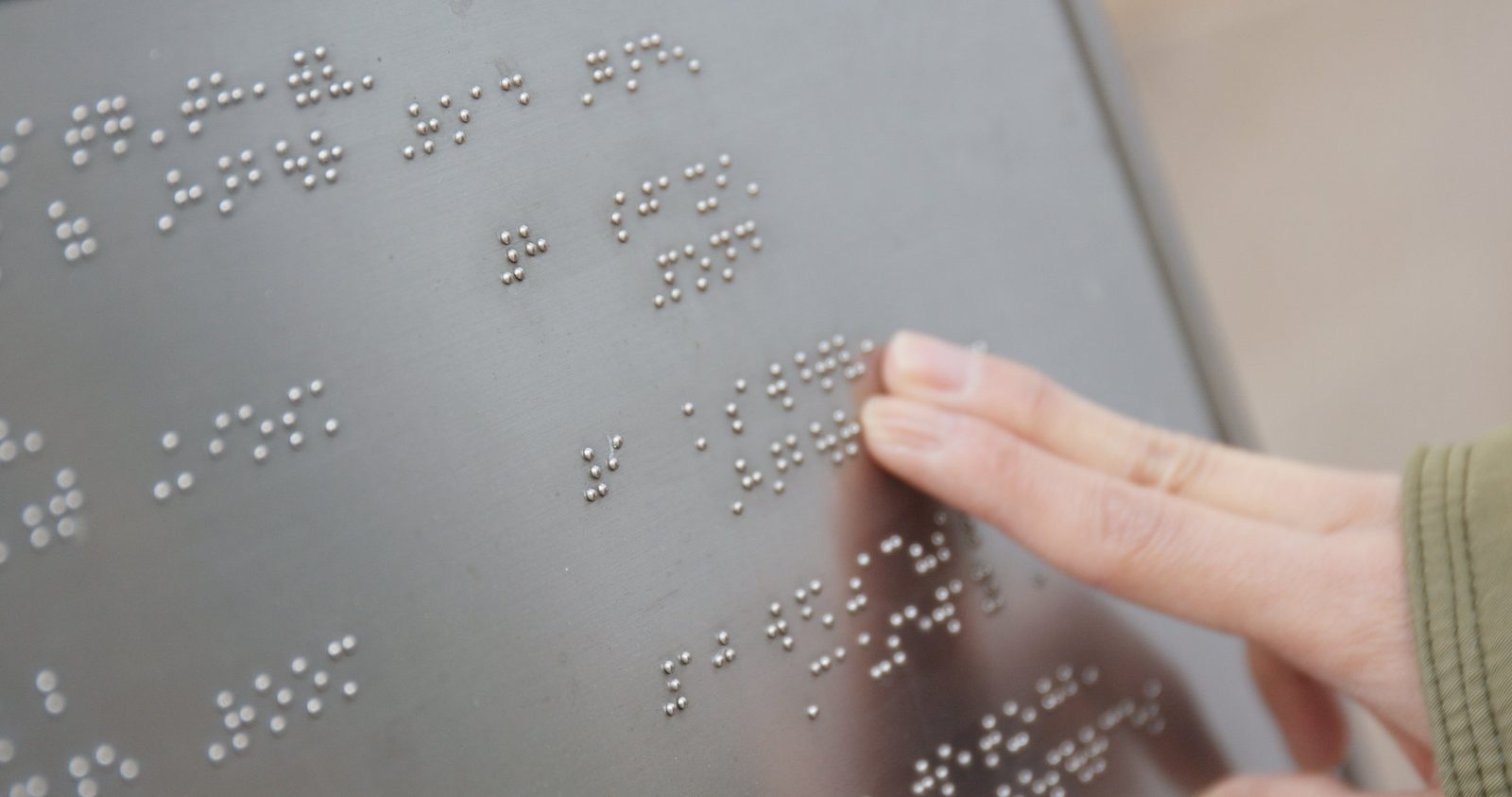
Raised letters are not enough on their own. The same text has to be repeated in Grade 2 braille, which is the contracted form most braille readers use, placed directly below the raised lettering.
This is the step that separates a real ADA sign from a nice plaque with dots on it. Braille has to be translated correctly and produced at the right size and spacing, which is why it should come from a shop that makes these signs regularly.
Make it easy to see
A sign that is read by touch is also read by people with low vision, so two more rules apply. The finish has to be non-glare, meaning matte rather than glossy. And the lettering has to contrast with the background: light on dark, or dark on light.
Silver letters on brushed aluminum look fantastic in a design presentation and disappear on an actual wall. Contrast wins.
Mount it where a hand expects to find it
Placement is where most signs fail, usually by a few inches.
- Height. The tactile text must sit between 48 and 60 inches above the floor. The 48 inches is measured to the baseline of the lowest line of raised characters, and the 60 inches to the baseline of the highest.
- Side. The sign goes on the wall beside the door, on the latch side. Not on the door itself, except in limited cases.
- Clear space. A person needs room to stand in front of it: at least 18 by 18 inches of clear floor, centered on the sign and outside the swing of the door.
The logic is simple once you picture it. Someone reading by touch should find the sign in the same place at every door, without a door opening into them while they do it.
Walk your building
You do not need a consultant for a first look. Take ten minutes, walk your space and check each permanent room against this list:
- Is there a sign at all?
- Does it have raised capital letters and braille underneath?
- Is the finish matte, with clear contrast?
- Is it on the wall at the latch side, with the text between 48 and 60 inches from the floor?
- Is anything blocking the space in front of it? A plant, a trash can, a very ambitious filing cabinet?
If you find gaps, you are in good company. Most buildings have a few, and they are usually inexpensive to fix compared with almost anything else on a facilities list.
We produce ADA and braille signage, so if your walk-through turns up signs that are missing or out of place, send us a list of the rooms and we will help you sort out what each one needs. The full requirements are published in the 2010 ADA Standards for Accessible Design, and the U.S. Access Board offers a clear illustrated guide to signs if you want to see the diagrams.